We build animated Facebook ads for supplement and health DTC brands. That means we watch a lot of ad libraries, and the thing you notice after the fiftieth one is not that the ads are bad. Most of them are competent. The problem is that they are the same. Same room, same lighting, same scoop, same "I was skeptical too" opener.
A buyer scrolling their feed is not comparing your ad to a good ad. They are comparing it to the last four ads they skipped. If yours is shaped like those four, it inherits the skip.
Every example here comes from work we have produced. We are describing formats and reasoning, not client results. You can watch the full versions on our animated ads portfolio.
Why "different" is a performance variable, not a vibe
People sort images before they read them. In roughly the time it takes to flick a thumb, the brain answers one question: do I already know what this is? If the answer is yes, the thumb keeps moving. That is not laziness. It is efficient, and it is why creative fatigue is so brutal in crowded categories.
Animation buys you a delay on that sorting step. A clay bedroom, a 3D character on a stage, a cutaway of an organ doing its job - none of those have a ready-made folder labelled "supplement ad I already ignored." The viewer has to look for another beat to work out what they are seeing. That beat is where your hook lands.
It is worth being honest about the limits. Different is not automatically better. A weird ad with no argument is still a weird ad. The formats below all pair an unusual surface with a specific persuasion job underneath.
1. The claymation sleep story
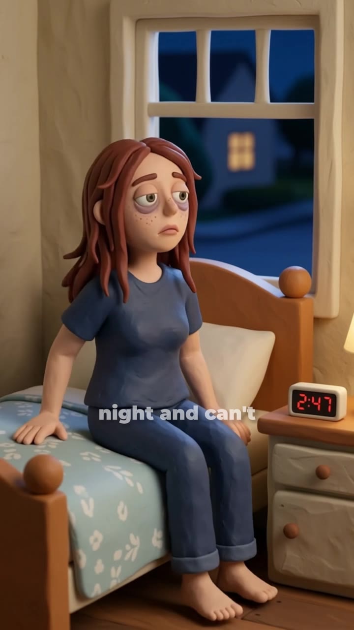
The hook: a soft, handmade world opens on the exact moment the buyer knows too well - lying awake, mind running, clock ticking.
Why it holds: claymation reads as a story, not a pitch. Story lowers the sales guard that a person on camera raises instantly. It also matches the product emotionally. Sleep is a soft, slow, private problem, and a soft, slow, handmade texture feels like it belongs to that world. Hard cuts and bright studio light fight the product they are selling.
When to use it: sleep, stress, calm, evening routine products. Anything where the buyer's pain happens in the dark and alone. Also strong for brands that want a gentle personality instead of a clinical one.
2. The 3D character foot-health explainer
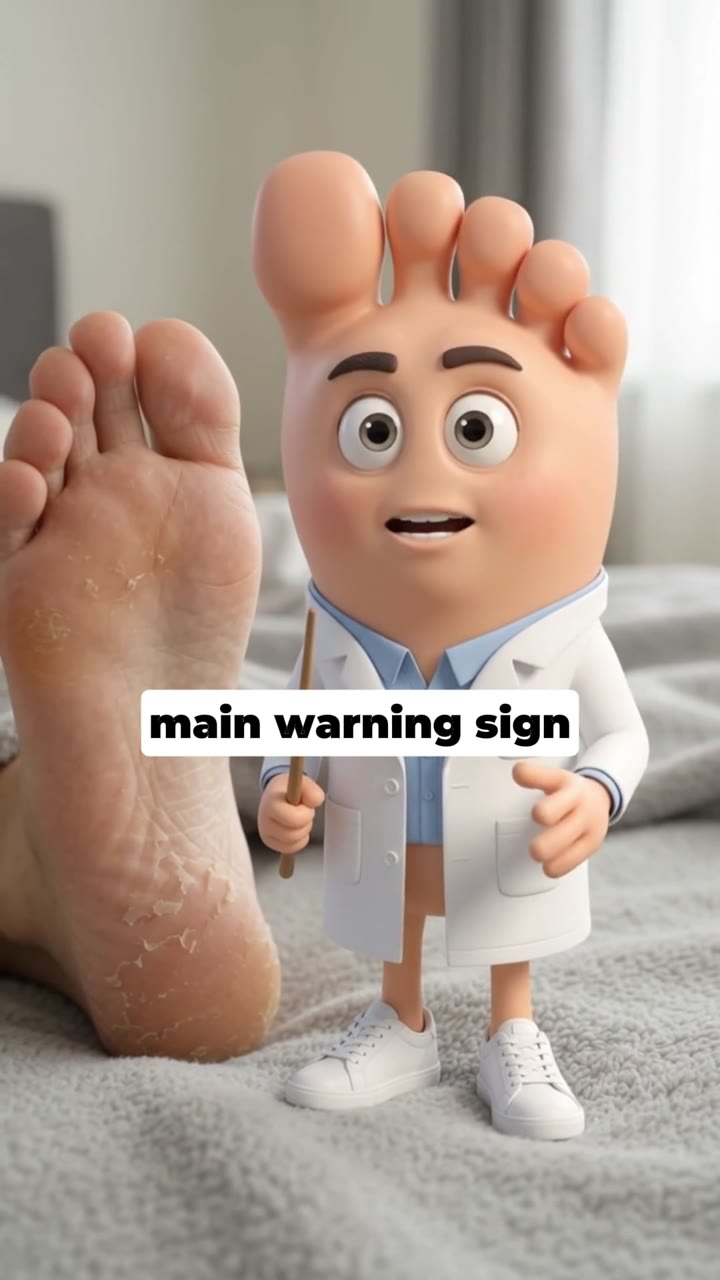
The hook: a character shows the problem happening to a body, at a scale nobody can film. Swelling, pressure, the thing that hurts when you stand up.
Why it holds: foot and joint problems are hard to photograph without being unpleasant. Real footage of a swollen foot makes people look away. A stylized 3D version keeps the recognition ("that is my morning") while removing the disgust reflex that kills watch time. You get the identification without the flinch.
When to use it: circulation, joints, feet, nerve discomfort, anything where the real thing is either invisible or unpleasant on camera. Also a good fit for older audiences who respond to a clear demonstration over a fast-talking testimonial.
3. The eye-health character story, built for the Spanish market

The hook: a character whose small daily defeats add up - squinting at a phone, holding a menu at arm's length, giving up on the small print.
Why it holds: it sells the consequence, not the condition. Nobody wakes up wanting an eye supplement. They want to read the label on the medicine bottle without asking their kid. A character story can stack three of those moments in fifteen seconds, which is very hard to do with a talking head without sounding like a list.
There is a second advantage here: localisation. An animated character has no accent problem and no casting problem. Producing the Spanish version means new voice and new on-screen text, not a new shoot with a new actor in a new country. For brands running several markets, that is the difference between one campaign and four.
When to use it: vision, hearing, memory, mobility - slow-decline problems where the buyer notices the symptom long before they name the category. Also any brand expanding into a second or third language.
4. The anti-copycat bottle character
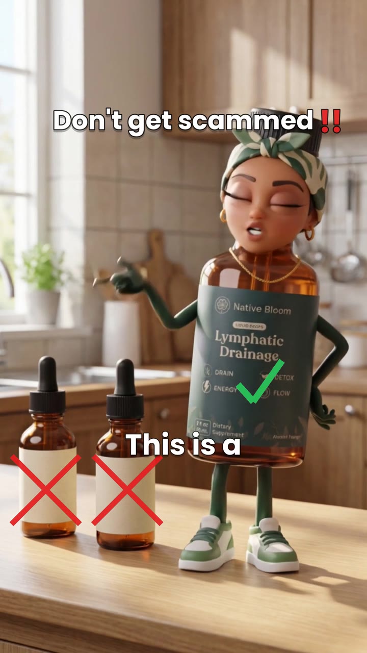
The hook: the product bottle is alive, and it is surrounded by lookalikes wearing its face.
Why it holds: this is a category-defense ad, and it does something no testimonial can. It turns a boring, defensive message ("beware of imitations") into a scene with a villain. The viewer roots for the real bottle. That is a completely different emotional posture from being warned about fraud, which makes people distrust the whole category including you.
It also works upstream. Once buyers have met your bottle as a character, every copycat listing they see afterwards looks like a knock-off of something they recognize. You are not just defending share, you are making your packaging into a memory.
When to use it: any brand with a winning offer being cloned on marketplaces, drops and tinctures with a distinctive bottle, and brands whose reviews are getting polluted by lookalike products.
5. The liver mechanism dramatization
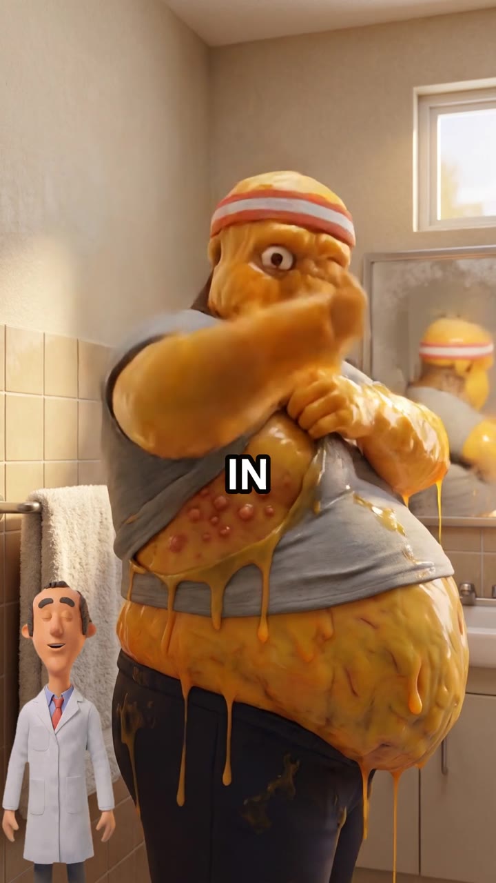
The hook: an animated cutaway of the process itself - what backs up, what clears, what the ingredient is supposed to be doing in there.
Why it holds: a mechanism answers the only question a sophisticated buyer still has. They have heard every claim. What they have not heard is why it would work. When an ad shows a process, the viewer does the persuading themselves, and self-generated belief is far stickier than a claim they were handed.
There is also a practical reason animation owns this format. A dramatization is clearly a dramatization. It is a diagram in motion, not a person in a white coat making promises about your body. That is a much cleaner place to stand when you are writing copy for a regulated category. We go deeper on that in show the mechanism, not the claim.
When to use it: liver, gut, kidney, metabolic and detox products. Any formula whose value depends on a process the buyer cannot feel directly on day one.
6. The 2D body-composition visual
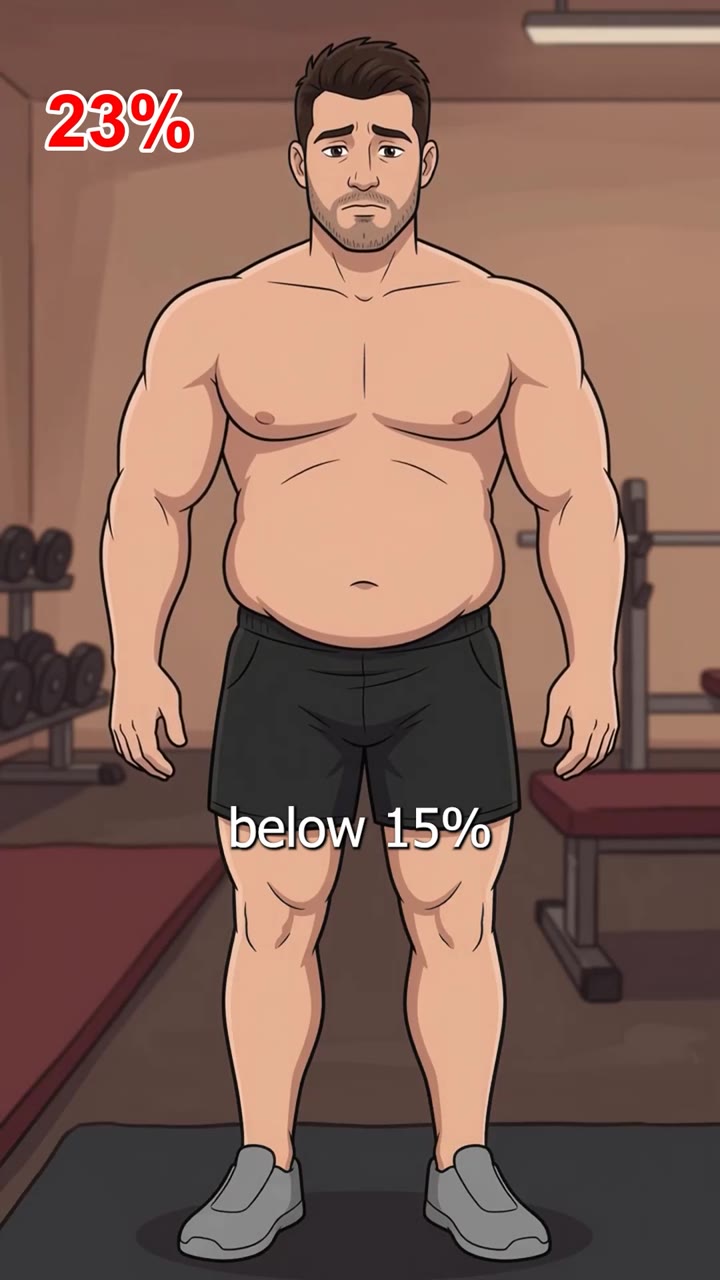
The hook: a clean, flat visual that makes an abstract comparison instantly readable - before and after, inside and outside, this versus that.
Why it holds: speed. 2D reads faster than 3D because there is less to look at. When the argument is a comparison rather than a story, extra realism just slows the viewer down. This is the format for ideas that only need three seconds and a clear picture.
It is also the cheapest format to version. One 2D system can produce a dozen genuinely different visual arguments in the time a 3D world takes to light. That matters when you need volume that is not just the same body with new subtitles - the trap we break down in creative volume vs creative diversity.
When to use it: body composition, dosage comparisons, ingredient-versus-ingredient arguments, and any month where you need several distinct concepts fast.
7. The UGC pet ad, in German (the contrast case)

The hook: a real owner, a real dog, and a visible change in the animal's coat and energy.
Why it holds: because here the proof is the footage. When the result is something you can see from the outside, filming it beats drawing it. No animation of a shinier coat will ever be as convincing as an actual shinier coat.
We include this one to kill a lazy argument. We are not anti-UGC. UGC is the correct format when the buyer needs to see a person or an outcome. It becomes a problem when it is the only format in an account, in a category where every competitor is filming the same shot. That decay pattern is the subject of why every supplement ad looks the same.
When to use it: visible outcomes - skin, hair, coat, energy, mobility. Also any market where trust is local and a native-speaking face carries weight, as with this German-market campaign.
Which format to run when
| Format | Persuasion job | Best fit |
|---|---|---|
| Claymation story | Lower the guard with warmth | Sleep, stress, calm, evening rituals |
| 3D character explainer | Show an unpleasant problem safely | Feet, joints, circulation, nerves |
| Character story | Sell the daily consequence | Vision, memory, mobility, multi-language |
| Anti-copycat character | Defend the category and the packaging | Cloned offers, distinctive bottles |
| Mechanism dramatization | Answer "why would this work" | Liver, gut, kidney, metabolic |
| 2D comparison visual | Make an abstract idea instant | Body composition, ingredient claims |
| Live UGC | Prove a visible outcome | Skin, hair, coat, energy |
How to test one of these properly
The most common way brands waste a good creative is by testing it badly. Four rules we hold to:
- Keep the control running. Put the new ad in the same campaign as your current winner. A challenger judged against last month's numbers is judged against a different auction.
- Give it enough budget to be seen. A creative that never exits the learning phase has not been tested, it has been starved.
- Change one thing. New format, same offer, same landing page. If you swap three variables you learn nothing about any of them.
- Judge it on the metric that pays you. Hook rate tells you if the opening works. Cost per purchase tells you if the ad works. They are not the same thing, and a great hook rate with bad economics is a warning, not a win.
One more habit worth stealing: when an animated ad wins, do not treat it as a finished asset. Treat it as a world. The set, the character and the style are now reusable, so next month's tests are new scenes rather than new productions. That is where the cost curve bends in your favour, and it is why packaging beats volume - a point we made for organic content in why your content isn't making money and that applies just as hard to paid.
If you want to see how these run at full length, the whole set is on the ads portfolio page, with the offer below.